The branding process revolves
around an
enhanced sensorial
customer experience
that let’s
them feel, imbibe and truly enjoy
their ultimate skincare regime.

Chemist at Play BASICS…
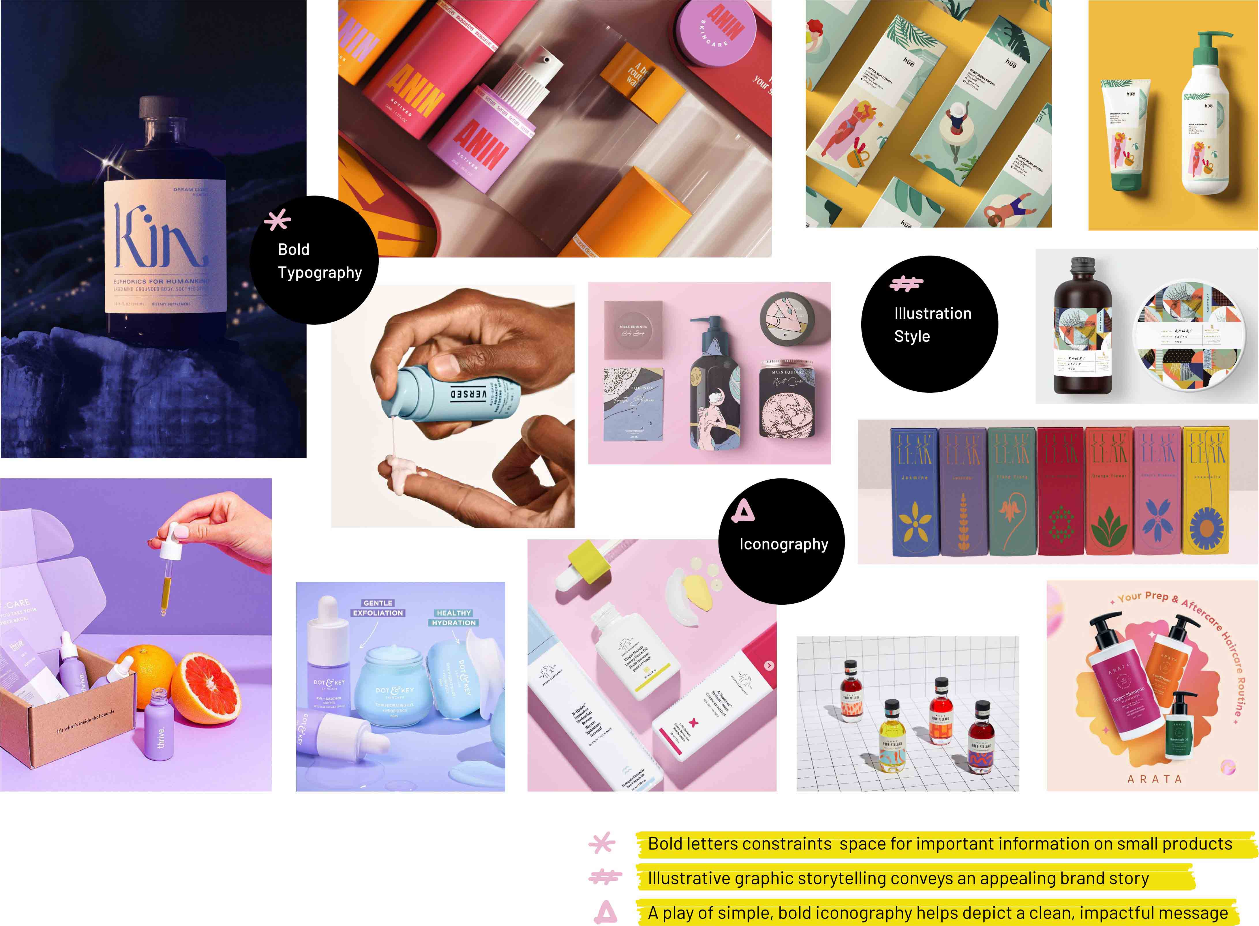
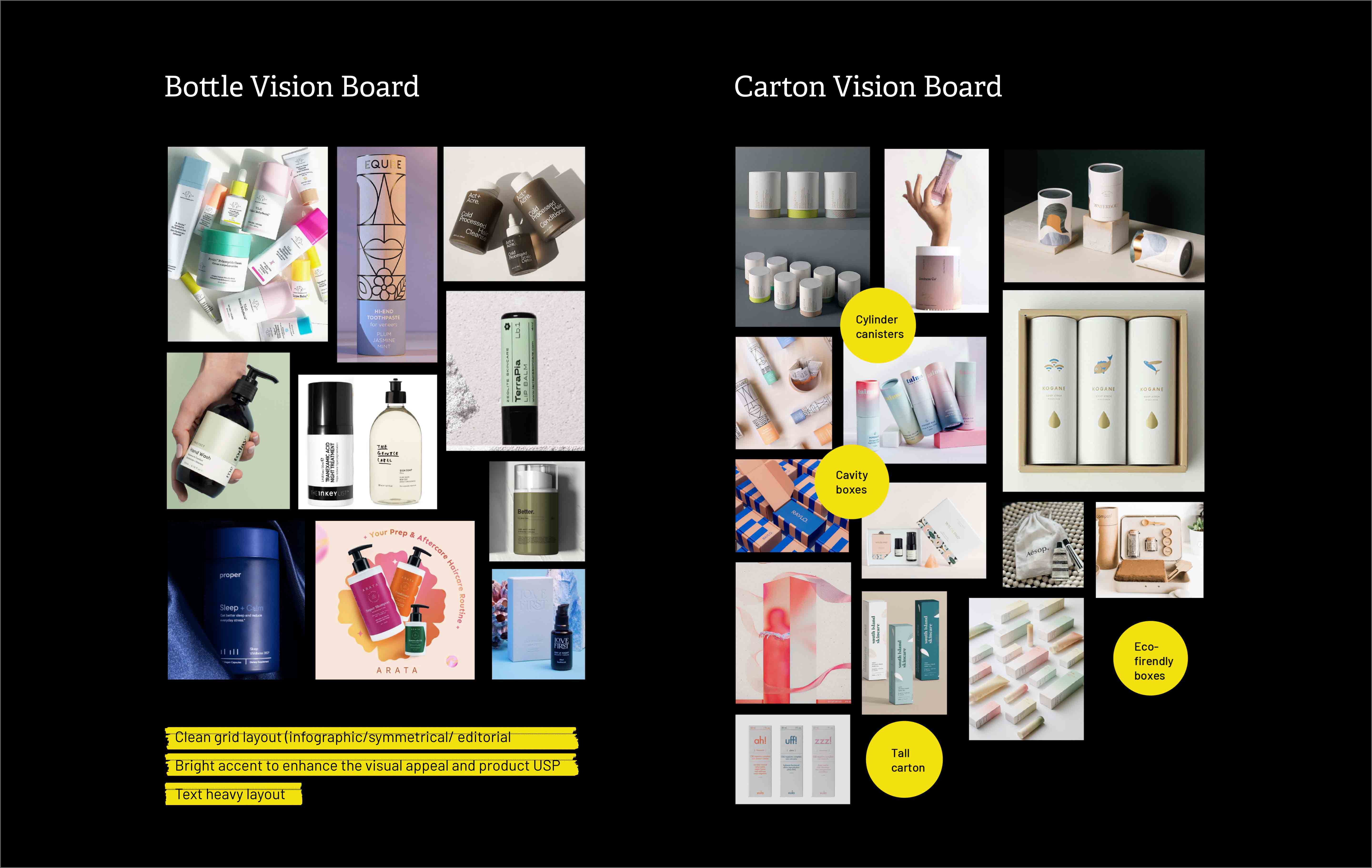
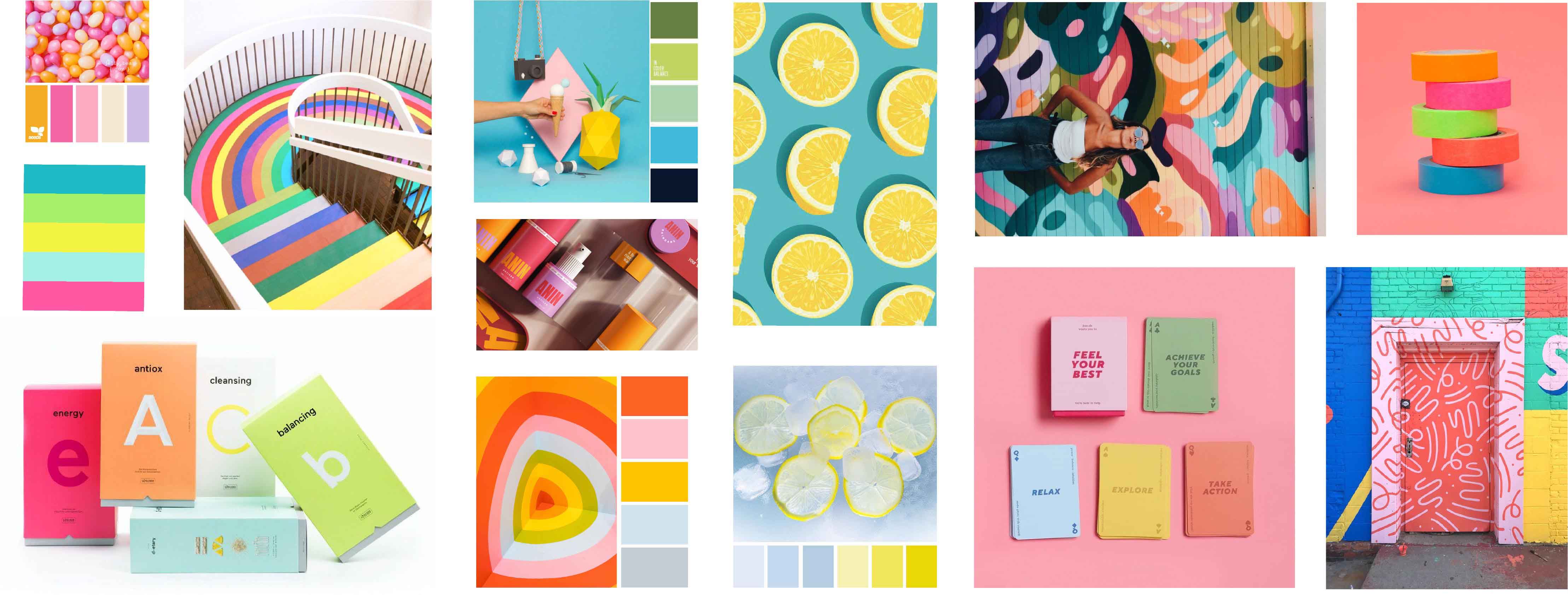
Packaging Vision Board
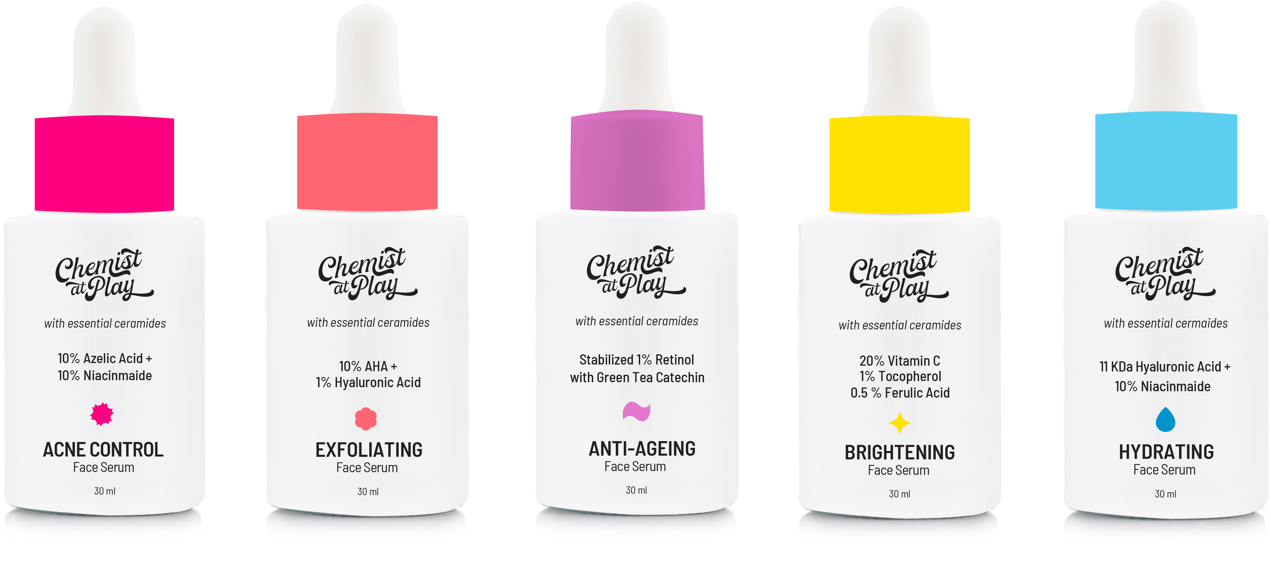
Hydrating
Face Serum
Acne Control
Face Serum
Exfoliating
Face Serum
Anti-Aging
Face Serum
Brightening
Face Serum
Color Board
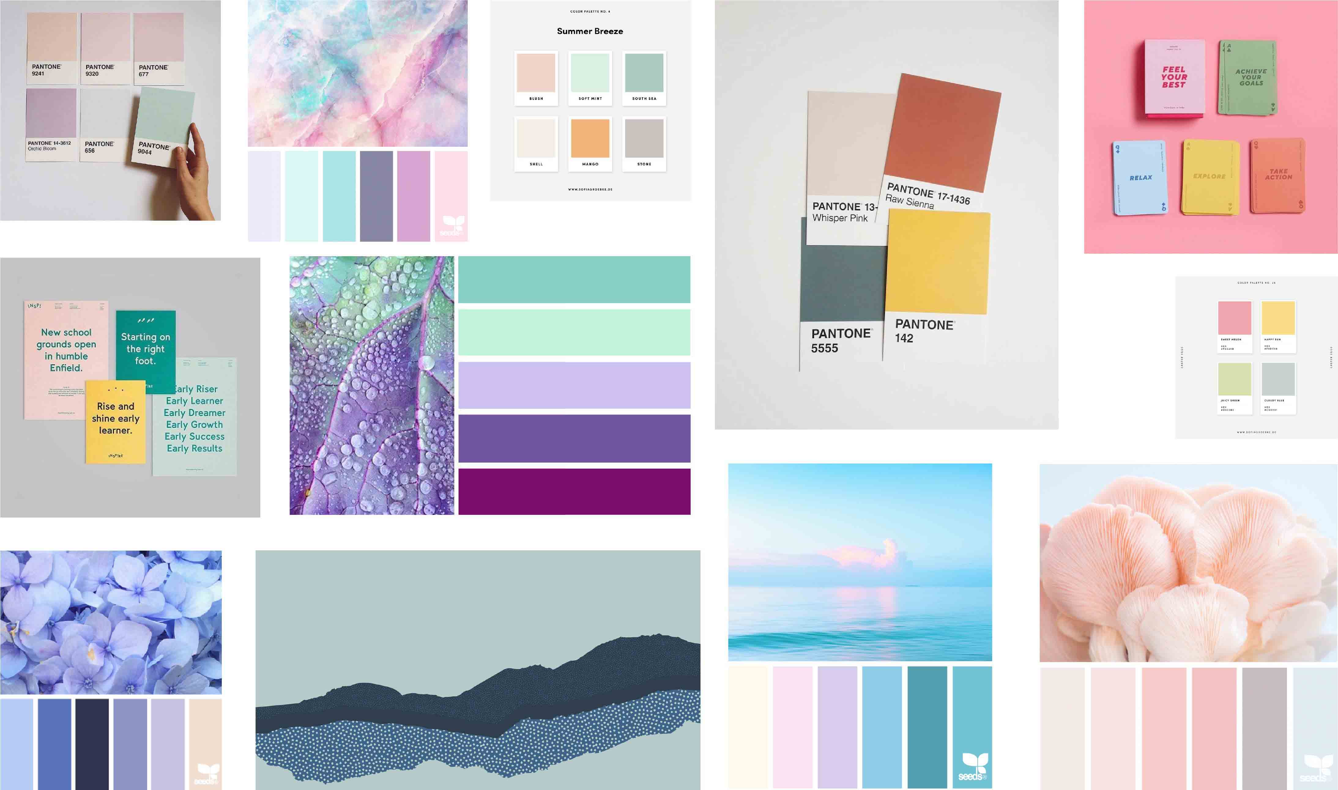

Color Board
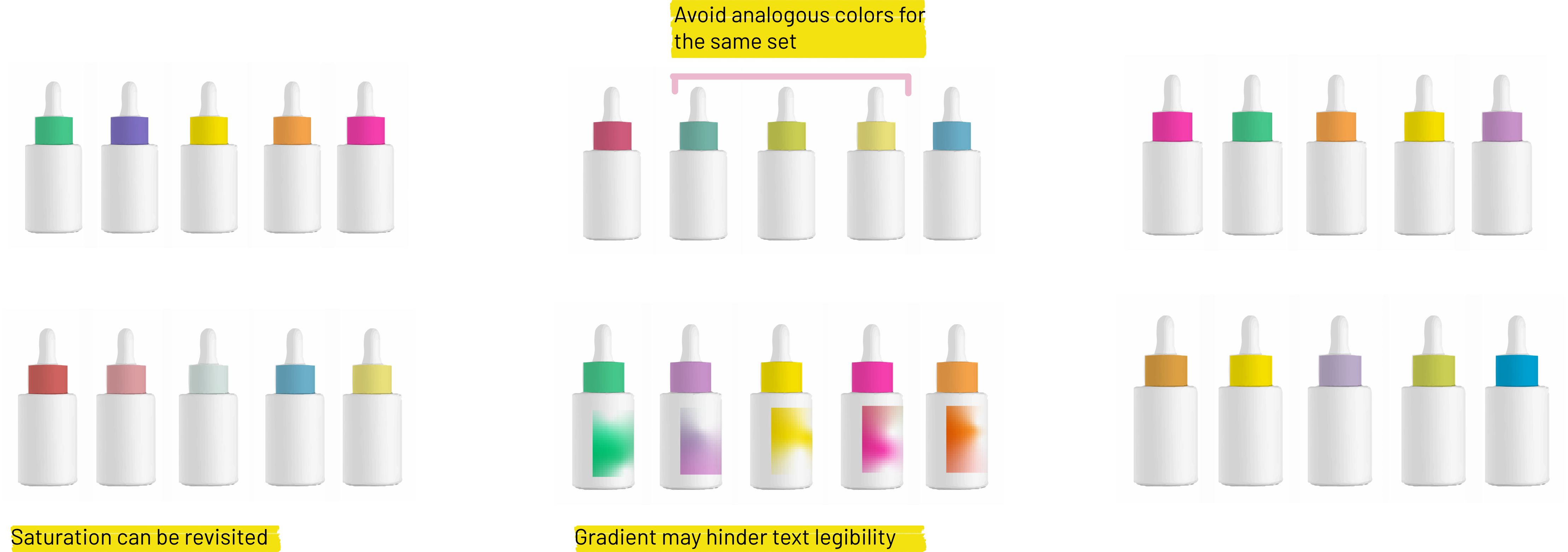
POP COLORS SELECTED
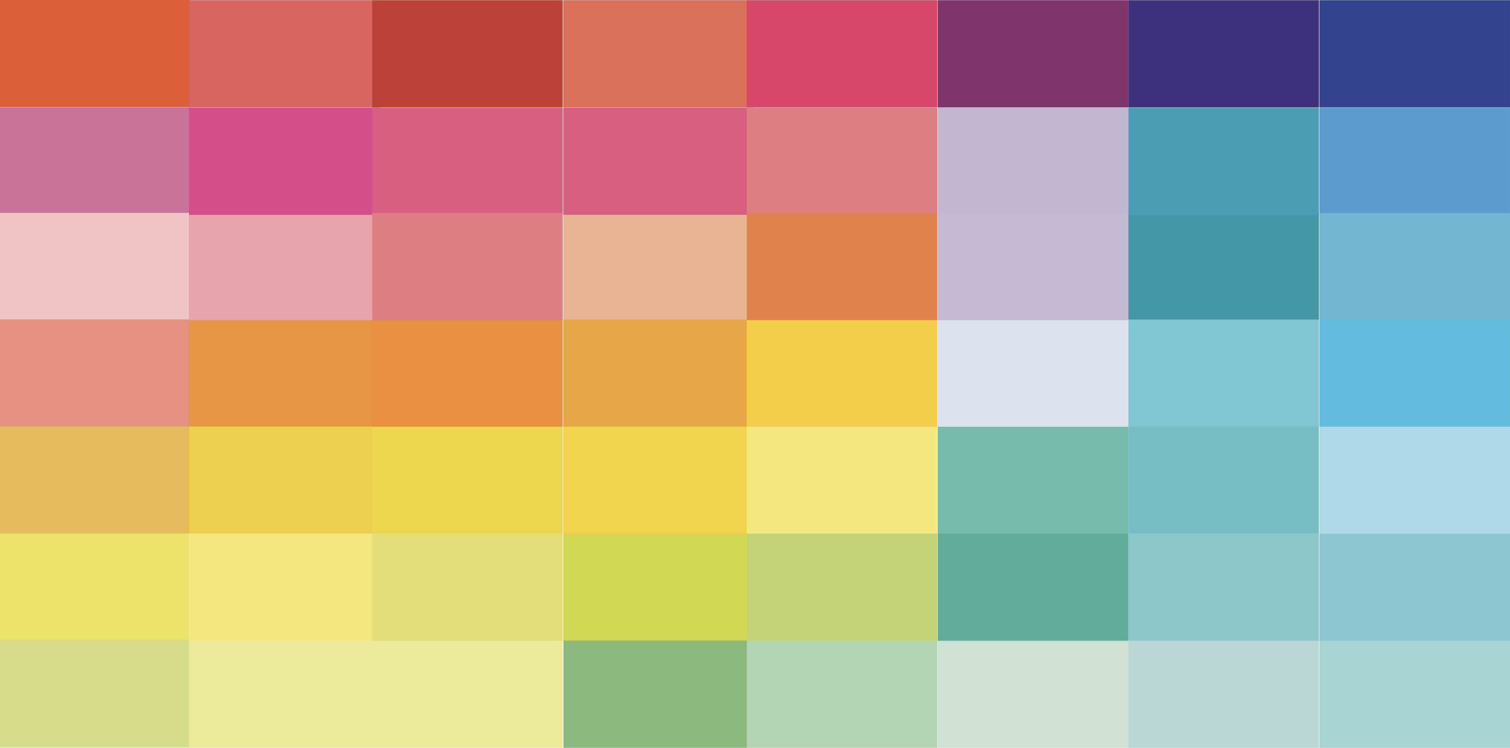
IDENTIFYING THE HIGH COLOR POINTS

COMPARATIVE REFERENCE FROM PANTONE COLOR BOOK

COMPARATIVE REFERENCE FROM NEON PANTONE COLORS

Chemist at Play COLOR PALETTE…
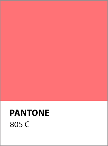
Exfoliating
Face Serum
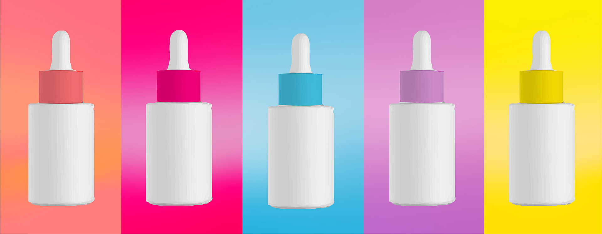
Face SerumThe tangy- pop orange color is visually appealing, grabs attention of the eye and evokes curiosity. The color is associated with exfoliating face serum resembling the soft blush and plump of the skin.
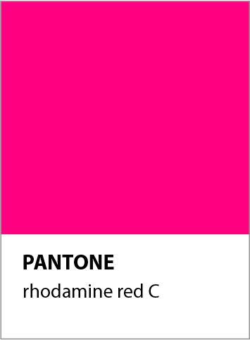
Acne Control
Face Serum
As passionate and vibrant, the color pink profoundly stands out as vibrant in the palette. The color has been associated with acne control face serum, depicting the redness of the skin.
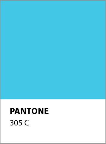
Hydrating
Face Serum
A composed color which soothes the eye is a perfect hue to balance the theme of pop colors. The color has been associated with hydrating face serum as it is the color of water, evokes freshness and makes the skin feel at ease.
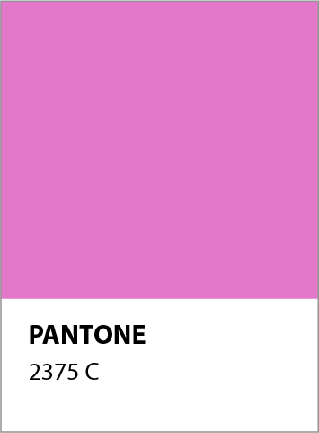
Anti-Aging
Face Serum
Combining the vibrant energy of color red and calmness of color blue, purple is the color of fine age. The color has been associated with anti-aging face serum as it is depicts wonder, beauty, and radiant energy.
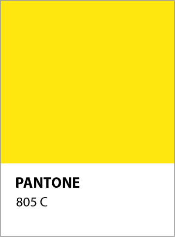
Brightening
Face Serum
Bringing in the radiance, excitement and charm with yellow, the palette pops out as bright and vibrant. The color has been associated with brightening face serum as it is the color for sun, radiance, glow, happiness and the fruit, lime.
Iconography
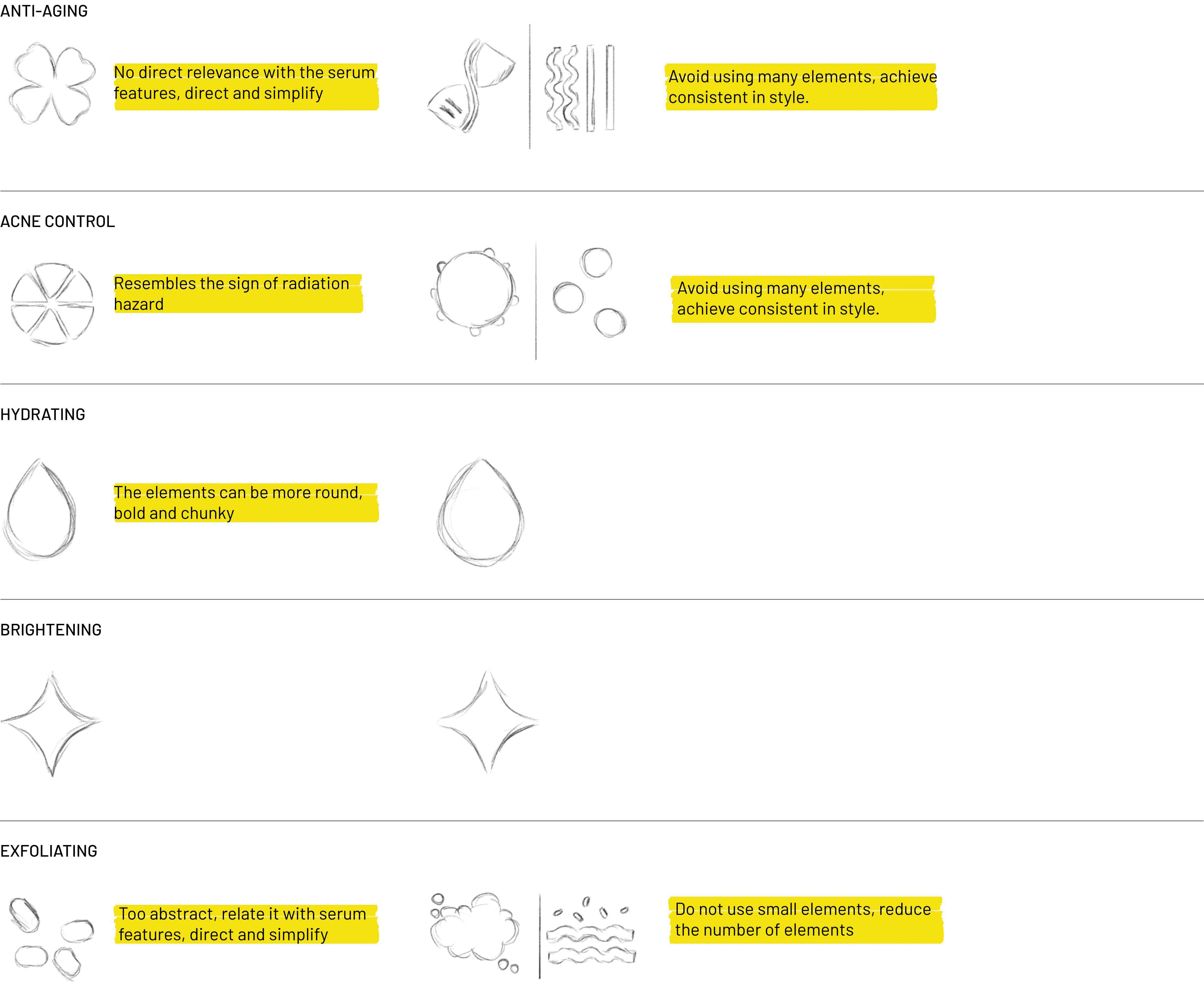
Chemist at Play ICONOGRAPHY…

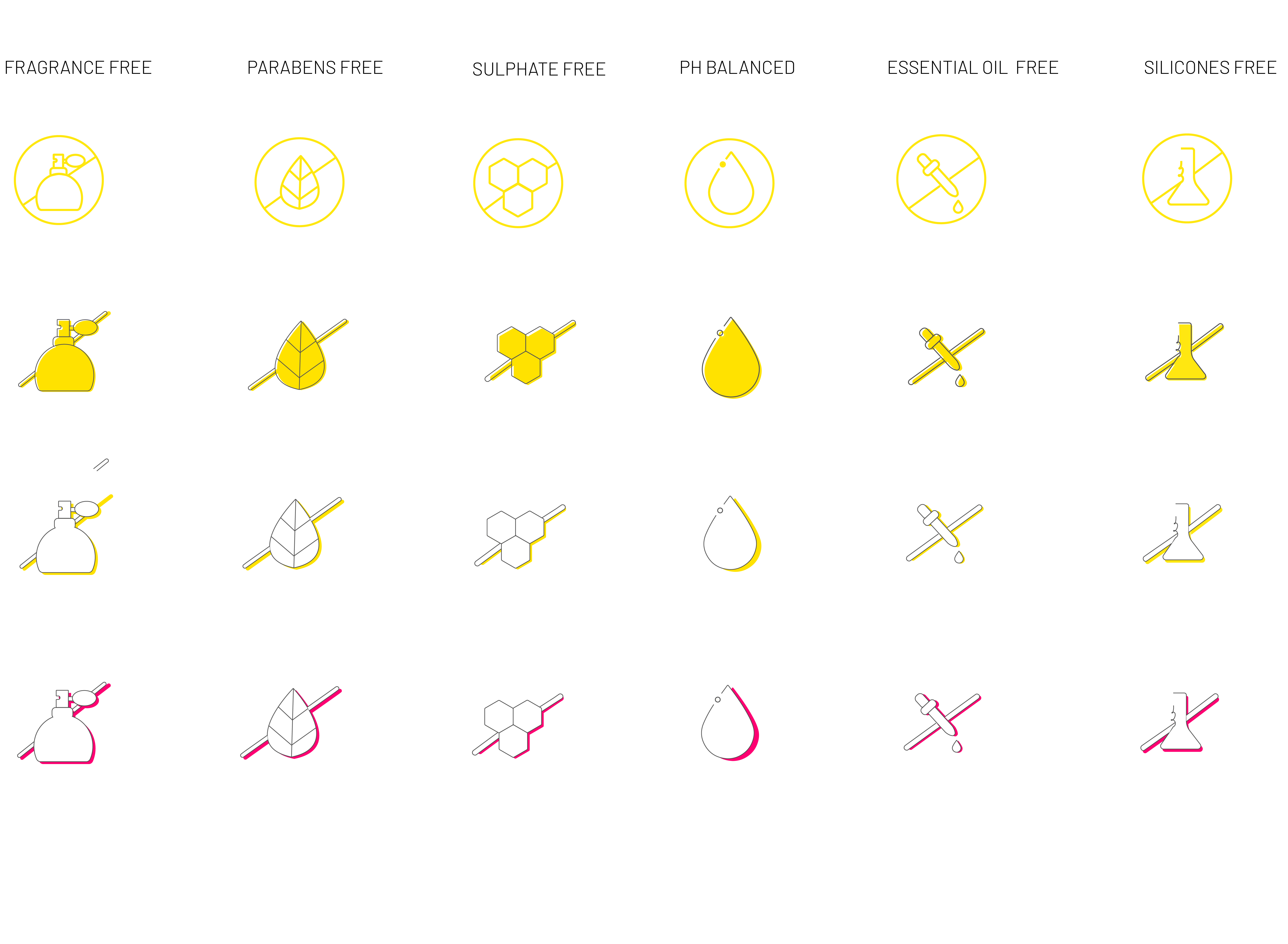
Product Feature Icons
Bottle Label Explorations (Labworks)

Bottle Label Shortlisted Layouts (Labworks)

Chemist at Play BOTTLE PACKAGING DESIGN…
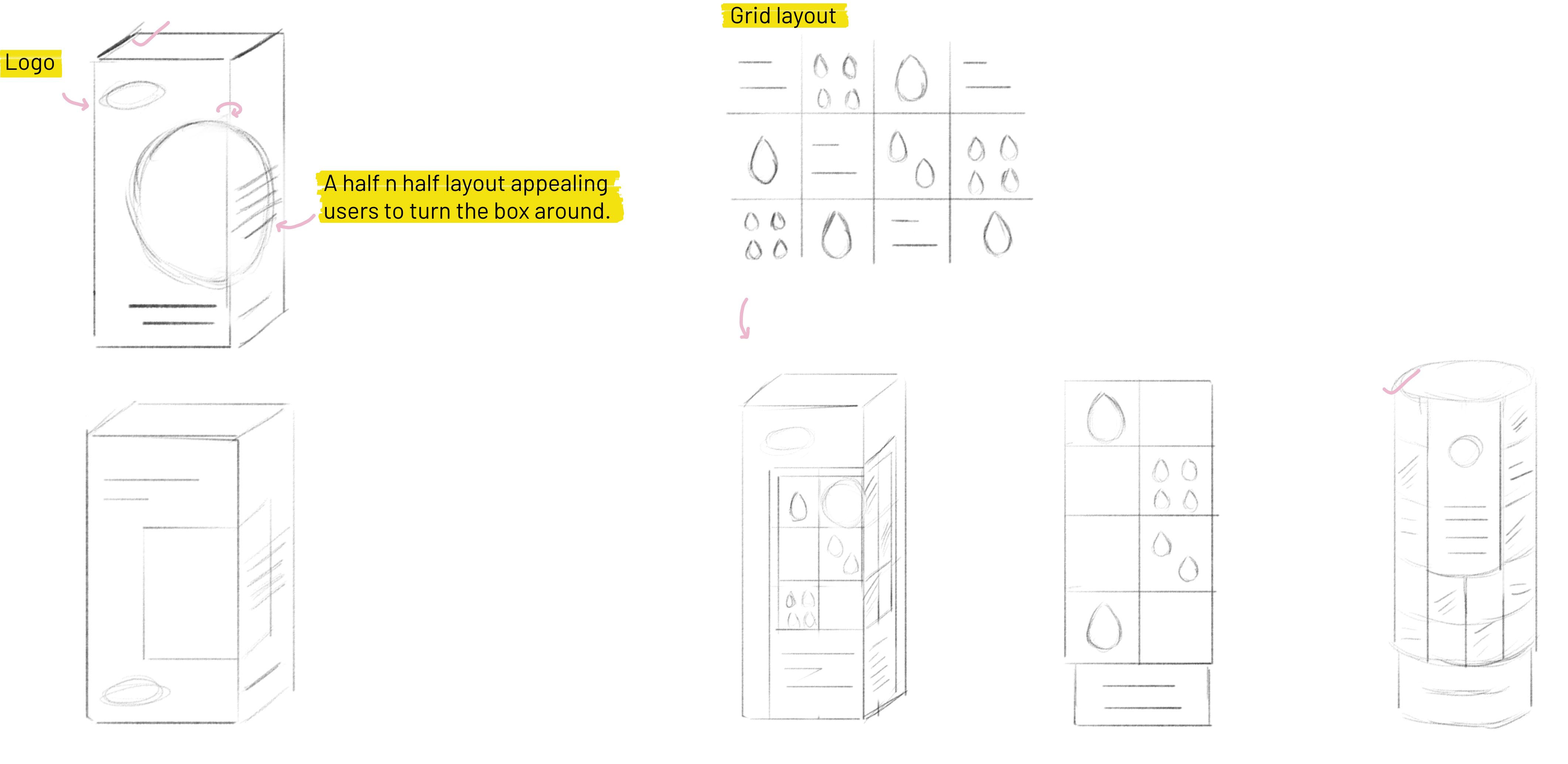
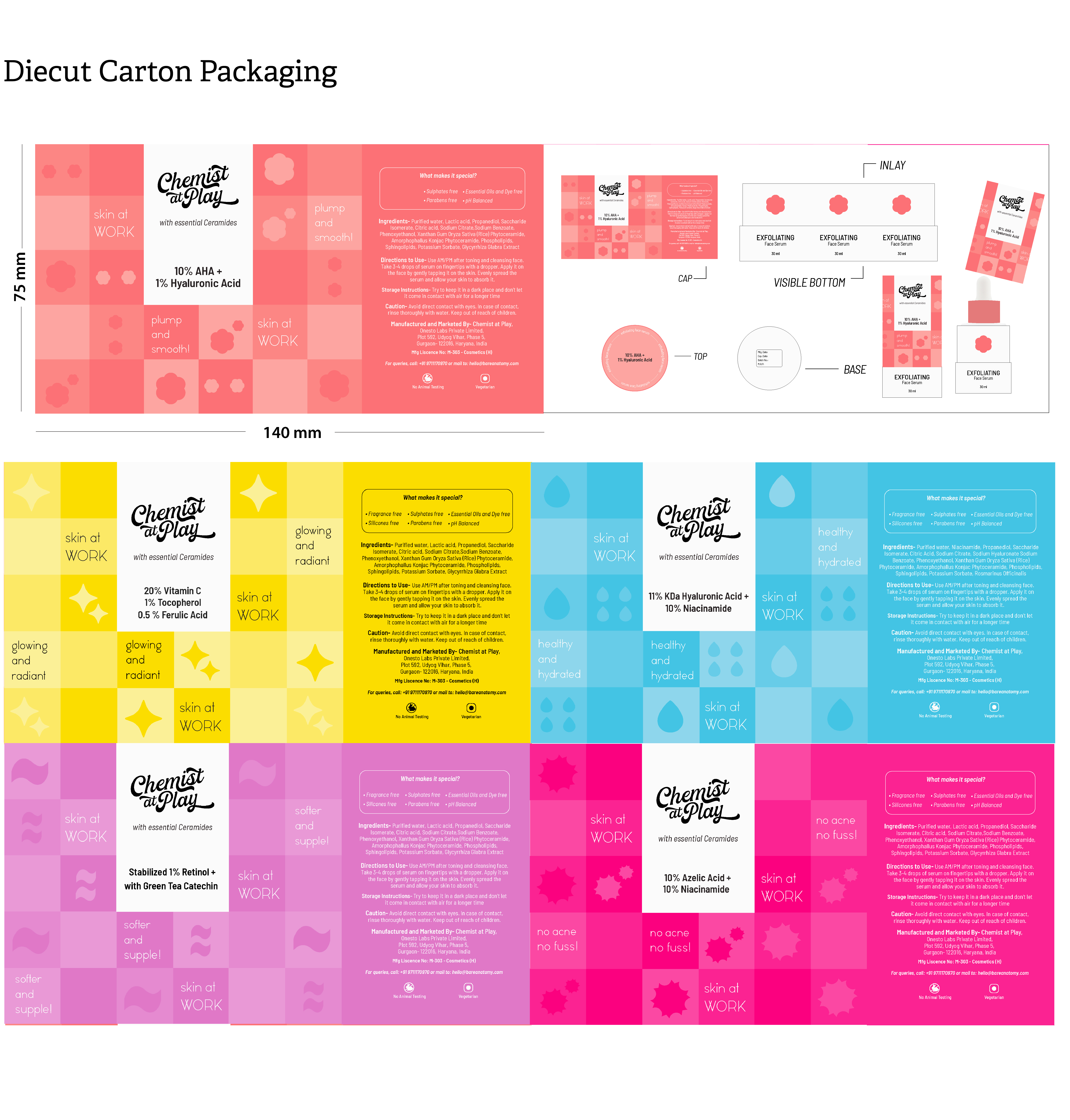
Carton Layout Concept
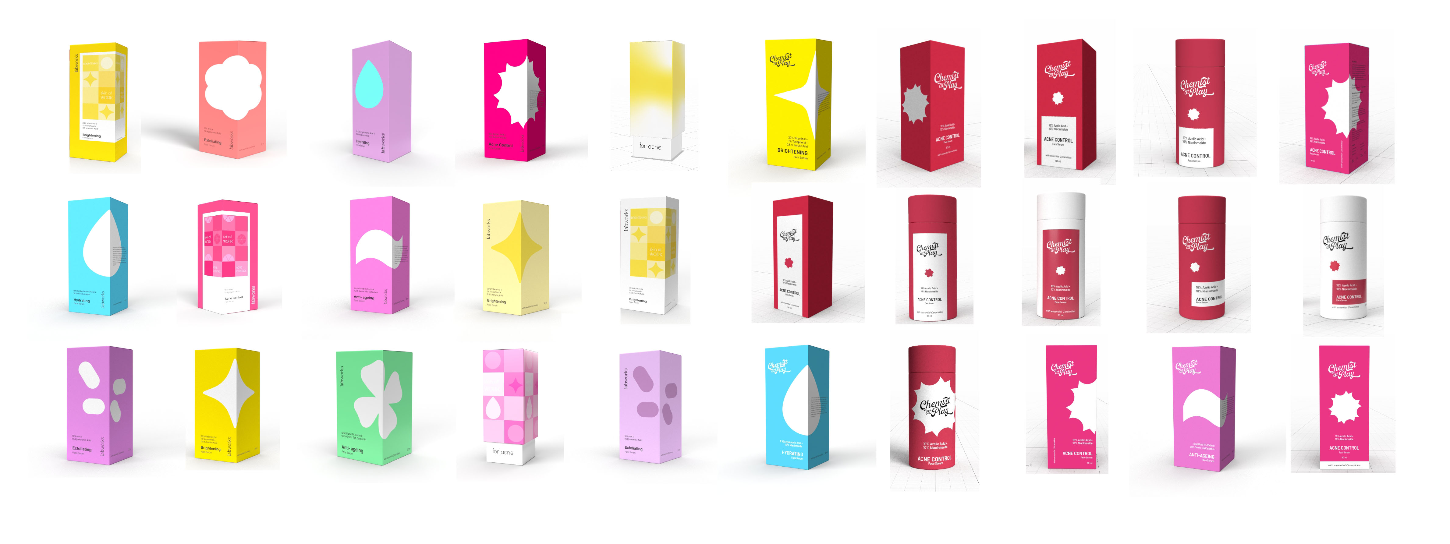
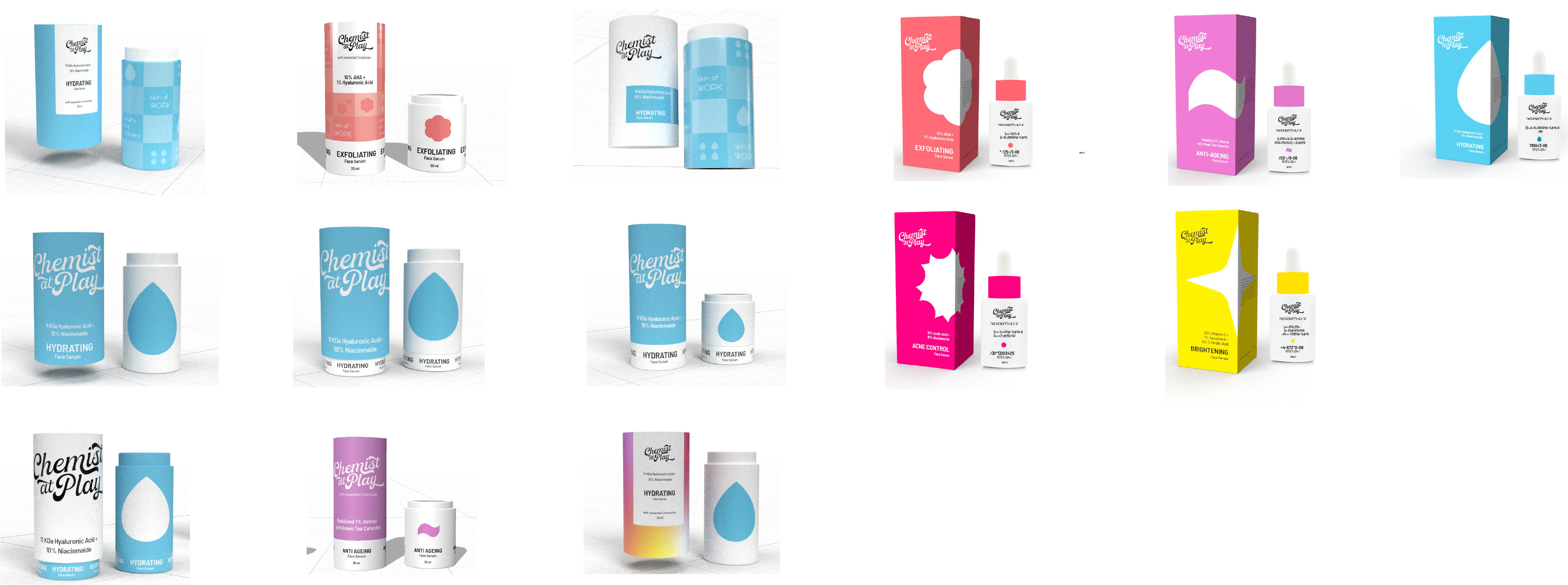
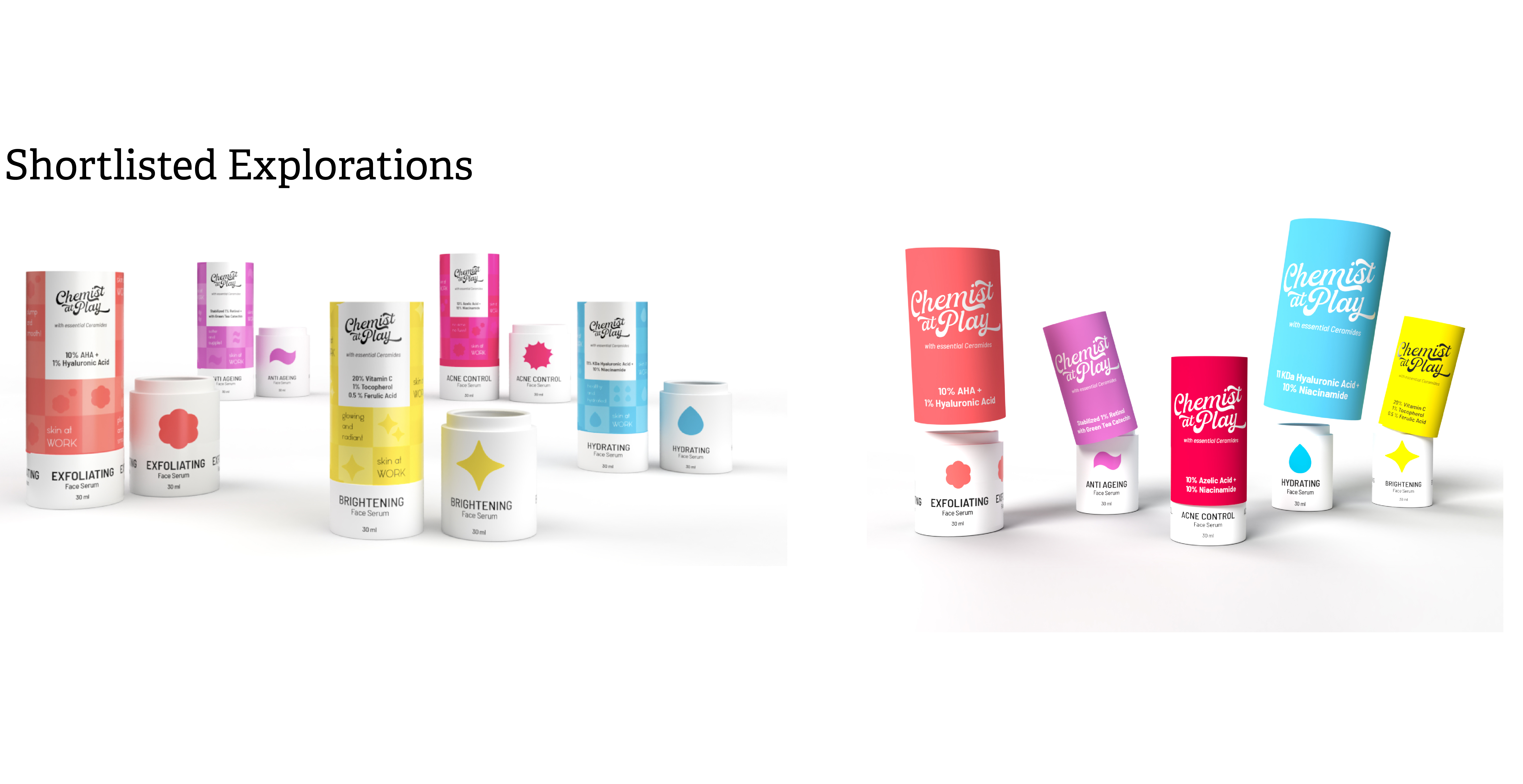
Carton Explorations
Carton Explorations
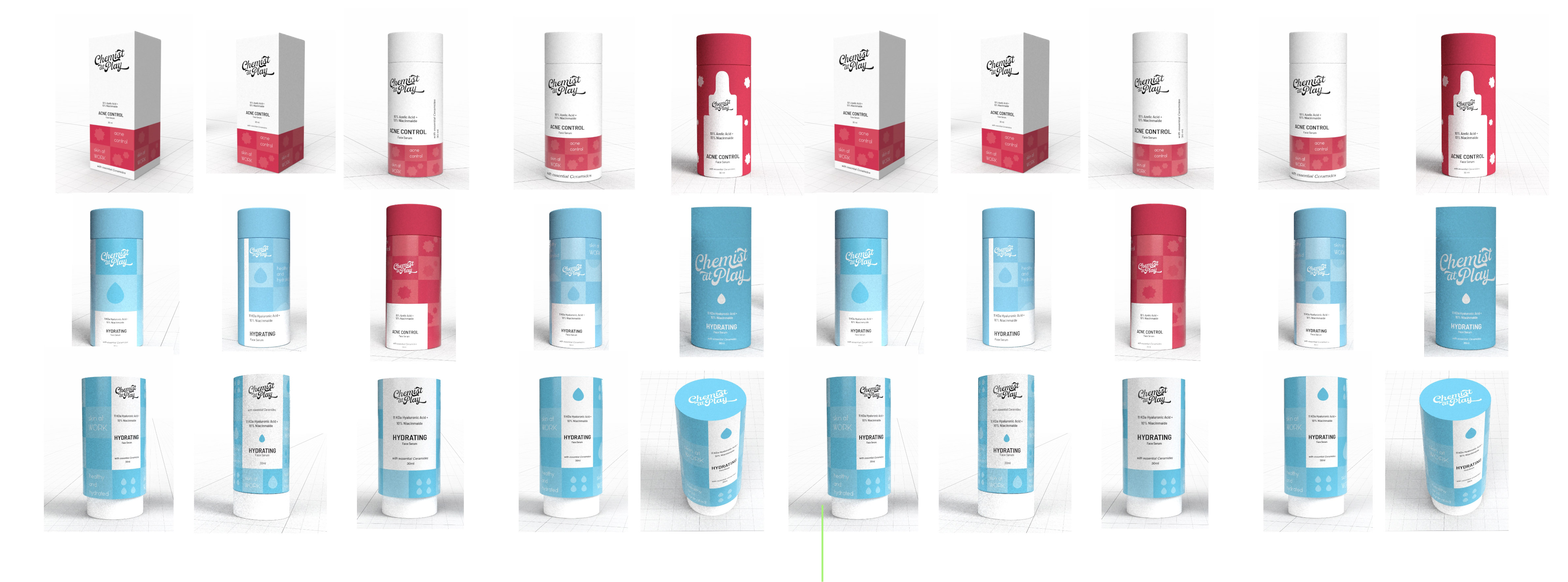
Carton Explorations
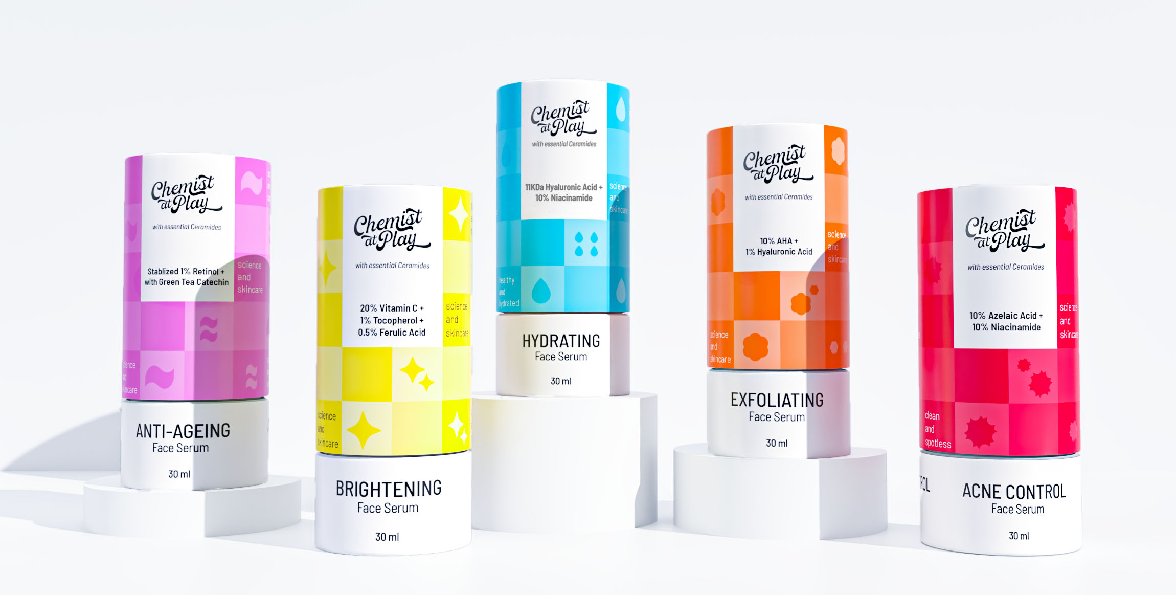
Chemist at Play CARTON PACKAGING DESIGN…
Back On top
